The Art and Science of Selecting the Ideal Font for Your Brand Identity
Your brand’s typography speaks volumes before a single word is read. That means deciding upon a font is one of the most critical decisions: it creates perceptions, elicits emotions, and generally sets how customers are going to relate to your brand. But with thousands of fonts available, how do you select the perfect typeface to capture your company’s unique personality and values?
What Is Font Psychology?
It is also important to know how different fonts can affect viewers subconsciously. Font psychology is implied as the study of visual characteristics in text influencing emotions, perception, and behavior.
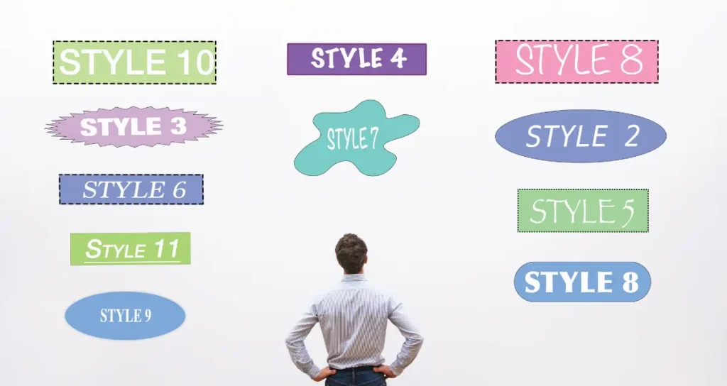
Serif Fonts: These serif fonts, like Times New Roman, often convey images of tradition, respectability, and formality. Small decorative strokes at the ends of the letters give a sense of authority and trustworthiness to the text. Therefore, they are popular among established institutions, luxury brands, and professional services.
Sans-Serif: Fonts sans-serif, much like Helvetica, connote an image of cleanliness, modernity, and a no-nonsense attitude. Because they have no flourishes, they tend to convey simplicity and efficiency, hence their popularity among technology companies and modern brands striving for a minimalist aesthetic.
Script: These fonts are digital representations of handwriting, and they range from elegant, formal cursive to casual, playful styles. They mostly evoke creativity, personalization, human-like touch, sophistication, or authenticity, often employed in luxury fashion brands and artisanal products.

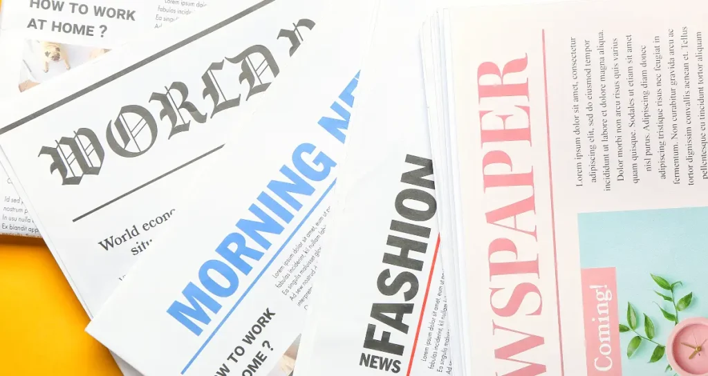
Display: These fonts are very stylized and decorative; they are supposed to catch the eye. They can very strongly convey the personality of a brand, but they should be used sparingly because by nature they are less legible when used extensively.
Applying this knowledge of association in psychology gives you a basis on which to choose the best fonts for your brand image and values.
Define Your Brand’s Typographic Personality
Before exploring specific fonts, take time to clearly articulate your brand’s core attributes and the emotions you want to evoke. Ask yourself:
- What are your brand’s key personality traits? (e.g. trustworthy, innovative, playful, luxurious)
- Who is your target audience and what appeals to them visually?
- What industry are you in and what are the typographic norms or expectations?
- Are there any cultural considerations for your global audience?
Create a mood board that conveys visual references to further set your typographic direction with imagery, color, and sample text that reflects your brand. This will be a great reference document to fall back on as you’re considering font options.

Key Factors to Consider When Choosing the Right Font
As you begin vetting fonts, here are some critical factors to remember:
1. Legibility and Readability
The most beautiful font in the world is unusable if it’s impossible to read. Be sure that whatever typeface you choose will be clear and very readable in a great range of sizes and formats—from vast signage to tiny mobile screens. Pay special heed to its digital rendering. There are many free fonts available online that you can check.
2. Versatility
Your brand font will need to work in a lot of different applications, so look for very robust font families with a variety of weights and styles to provide flexibility within your designs. This will give you the hierarchy and emphasis that you need within the typography system.
3. Uniqueness vs. Familiarity
While you do want a font that stands out, the choice of something too unconventional should be looked at with care. Many slightly altered versions of classic typefaces hit the middle ground between familiarity and uniqueness perfectly. Custom fonts are an extremely powerful tool for a brand but require a huge investment.
4. Technical Considerations
Make sure that your chosen font comes with all the needed file formats and is licensed for commercial use. Web-safe fonts, or ones hosted through services like Google Fonts, really do make implementation pretty easy across digital platforms.
5. Emotional Resonance
Ultimately, the brand font will “feel right” and authentically represent your company’s personality. Don’t underestimate the power of a gut feeling in this decision.
Font choice is part of your brand’s design strategy. Take a little time to play around with fonts, test them in different contexts, and ask for feedback from those whom you trust. With the right font, you’re going to elevate that brand presence and really make good first impressions on your customers.
Conclusion
In conclusion, selecting the right typography for your brand is a vital decision that goes beyond mere aesthetics. The font you choose is a powerful tool that shapes perceptions, evokes emotions, and communicates your brand’s values to your audience.
By understanding font psychology, defining your brand’s typographic personality, and considering key factors such as legibility, versatility, uniqueness, technical aspects, and emotional resonance, you can make an informed choice that enhances your brand identity.
Remember, the right font not only elevates your brand presence but also forges a strong and lasting connection with your customers. So, take the time to explore, experiment, and ultimately choose a typeface that truly captures the essence of your brand.
FURTHER READING


